The visual identity will serve to communicate the project effectively and attractively among stakeholders and the general public. It refers to the main ideas of the project.
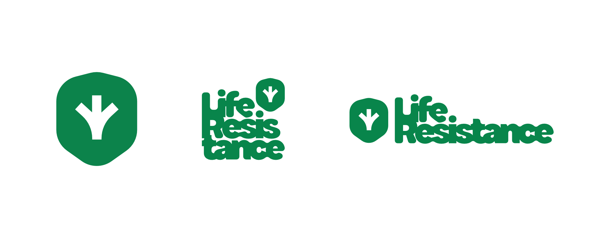
The project logo has an organic character. It symbolises life regardless of its form. The graphic design depicts a sign thrown into the water, which slowly dissolves and also refers to the rewetting of the sites. It does not have clear lines and the letters connect to each other.

The symbol of the project combines the flora and fauna of the Danube floodplain habitats. It represents the fingerprints of birds and the greenery growing up at the same time. They are placed on a green background in the shape of a shield as a symbol of their defend.

The pattern takes the idea of the logo and develops it into new forms. It represents a bird’s eye (drone) view of the diversity of the project area. It also resembles the spots of cattle that will take care of the suppression of invasive plants at some sites. The pattern has a decorative function and we will use it in the background and blend it with other elements of the visual identity.


